The Fast Rule: Drop Cap Formatting for Amazon KDP
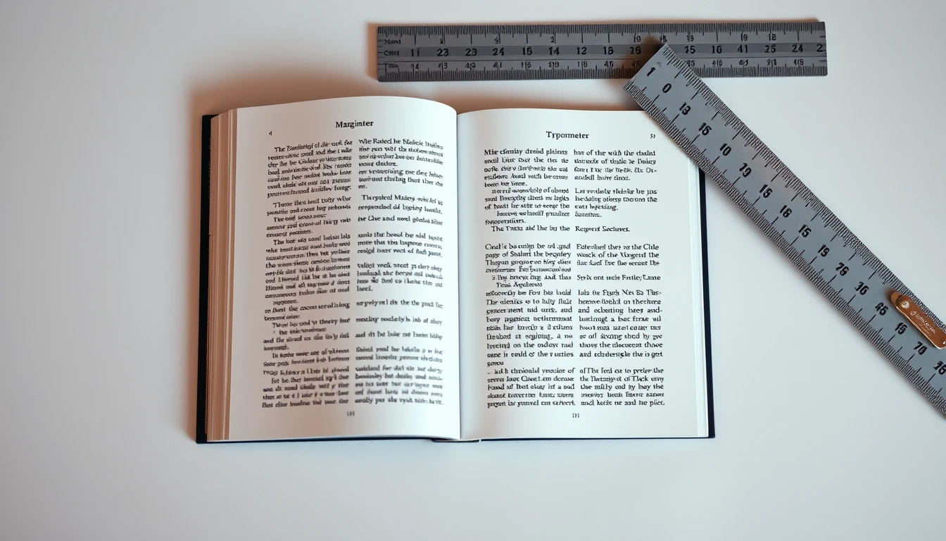
In classical book design, a drop cap (initial cap) drops 2 to 3 lines into the opening paragraph of a chapter or major section, with its cap-height aligning precisely with the ascenders of line 1 and its baseline aligning with line 2 or 3. For Amazon Kindle ePub 3, use the standard CSS pseudo-element `p.opener::first-letter` with `float: left`, `line-height: 0.85`, and explicit margin offsets. For print PDFs, configure native InDesign Drop Caps (Paragraph Styles -> Drop Caps and Nested Styles: 3 lines, 1 character) to guarantee zero baseline drift.
The Fast Rule: Drop Cap Formatting for Amazon KDP
In classical book design, a drop cap (initial cap) drops 2 to 3 lines into the opening paragraph of a chapter or major section, with its cap-height aligning precisely with the ascenders of line 1 and its baseline aligning with line 2 or 3. For Amazon Kindle ePub 3, use the standard CSS pseudo-element `p.opener::first-letter` with `float: left`, `line-height: 0.85`, and explicit margin offsets. For print PDFs, configure native InDesign Drop Caps (Paragraph Styles -> Drop Caps and Nested Styles: 3 lines, 1 character) to guarantee zero baseline drift.
- ✓ Print Standard: 3 lines deep, aligning the cap-height with Line 1 and the baseline with Line 3.
- ✓ Kindle ePub Standard: Use `float: left` with small right margin (`margin-right: 0.12em`) to prevent text collision.
- ✓ Never use drop caps after mid-chapter headings or blockquotes; apply strictly to the first paragraph following a chapter title.
The Anatomy of Classical Drop Caps: Cap-Height, Baseline, and Margins
The Anatomy of Classical Drop Caps: Cap-Height, Baseline, and Margins
Drop caps are the oldest typographic swagger in the book. Illuminated manuscripts from the 8th century used them to signal chapter openings; Gutenberg's 42-line Bible carried hand-painted two-color initials into the margins. Five hundred years later, they still work. A single oversized letter tells the reader's eye: stop here, a new movement begins. That's why trade publishers from Penguin to Knopf keep them in fiction, memoir, and literary nonfiction.
But a drop cap is not a decorative flourish. It is a precision mechanical object. Get the geometry wrong by 0.5 pt and the whole page reads amateur. Here are the four rules that govern a classical 3-line drop cap.
Rule 1: Cap-Height Alignment
The top of the initial letter must sit on the cap-height line of line 1 — the same invisible line the first capital of "CHAPTER" sits on. Not the ascender line. Not the x-height. The cap-height.
For a body font like Garamond Premier Pro at 11 pt with a 16 pt leading, cap-height typically measures 7.2 pt. So the drop cap's cap-height must also equal 7.2 pt, not its point size. A 42 pt Baskerville initial has a cap-height of roughly 29 pt — meaning the point size you set is not the metric you align. This is where 90% of self-published layouts fail.
Rule 2: Baseline Lock on Line 3
The bottom of the drop cap rests on the baseline of line 3. Not line 2. Not "close enough." The baseline of the third line of body text.
Calculated precisely:
- Leading = 16 pt
- 3 lines of text = 3 × 16 = 48 pt from baseline 1 to baseline 3
- Drop cap baseline offset = 32 pt below baseline 1
In InDesign, this is controlled via Paragraph > Drop Caps and Nested Styles, then fine-tuned with baseline shift. In Word, it's Insert > Drop Cap > Options > Lines to drop: 3, followed by manual baseline nudging. Neither is automatic. Both require the designer to verify against a printed proof.
Rule 3: Zero Text-Indent, Flush Left
The drop cap sits flush with the left text margin. No indent. No optical overhang. If your body text uses a 12 pt first-line indent, the drop cap paragraph overrides it with 0 pt indent and no left spacing.
This matters because the drop cap becomes the visual anchor of the left column edge. Any drift — even 2 pt — creates a visible staircase effect down the page.
Rule 4: Letter-Specific Right Clearance
Here is the rule almost no one teaches. The margin-right on a drop cap is not a fixed value. It depends on the letter's right-hand silhouette.
| Letter Shape | Examples | Right Clearance |
|---|---|---|
| Right-leaning diagonal | A, V, W, Y | Tight (0–2 pt) |
| Vertical stem | I, H, M, N, B, D | Generous (6–10 pt) |
| Curved right bowl | C, G, O, Q, S | Medium (4–6 pt) |
| Descender/lowercase-adjacent | J, T, L | Medium (4–6 pt) |
Why? A "W" already creates a diagonal void to its right — the adjacent lowercase text can tuck closer. An "I" is a straight vertical wall; without a 6–10 pt buffer, the following text feels crammed against it. Classical foundries like Hoefler and Frere-Jones build this into their optical spacing. Automated tools must replicate it manually.
BooklierAi handles this automatically. The platform reads each drop-cap glyph's bounding box and applies per-letter right-clearance values before exporting print-ready PDF/X-1a files with calculated gutter margins. No manual kerning pass required.
Get these four rules right and your chapter openings look like they came off a Knopf press. Get them wrong and readers feel the wrongness even if they can't name it. Precision is the whole game — which is exactly why the next section covers what happens when you try to port that same geometry into a reflowable Kindle file, where fixed positions collapse into chaos.

Automate Drop Cap Typography in Seconds
Stop struggling with broken drop caps that overlap text or crash Kindle e-readers. BooklierAi applies mathematically perfect 3-line drop caps across print PDFs and reflowable ePubs automatically.
The Small Caps Transition Rule: Bridging Display and Body Typography
The Small Caps Transition Rule: Bridging Display and Body Typography
A drop cap is a visual shout. The body text that follows is a whisper. Without a bridge between them, the reader's eye slams into a wall. That bridge is the small caps lead-in, and it is the single formatting decision that separates a book that looks designed from one that looks dumped into a template.
Here is the problem in raw terms. Set a 3-line drop cap at 3x your body size—say 33pt cap against 11pt body—and the next word starts at 11pt lowercase. The optical jump from a 33pt capital to an 11pt x-height is roughly 300%. The eye reads that as a glitch, not a flourish. This is why so many self-published books with drop caps feel broken even when the technical rendering is perfect.
The Lead-In Small Caps Convention
The fix is old, proven, and used by nearly every trade publisher since the 1920s. After the drop cap, set the first 3 to 5 words—or the entire opening clause—in small caps. This creates a graduated staircase: giant capital, then medium capitals, then body text.
SMALL CAPS LEAD-IN: 9pt (82% of 11pt body), tracking +40
BODY: 11pt / 15.5pt leading
Point Size and Tracking Math
Small caps must never be set at 100% of body size. They read as shouting. Set them at 80–85% of your body font size. If your body is 11pt, your small caps land between 8.8pt and 9.35pt. Round to 9pt.
Tracking matters more than size. Small caps set at default letterspacing look cramped and muddy because capital letterforms have more internal white space than lowercase. Add +30 to +50 tracking units (0.03em to 0.05em in CSS, or 30–50 in InDesign's tracking field).
| Body Size | Small Caps Size | Tracking | Use Case |
|---|---|---|---|
| 10pt | 8.5pt | +35 | Mass market paperback |
| 11pt | 9pt | +40 | Standard trade |
| 12pt | 10pt | +45 | Large print / YA |
Syntactic Phrasing: Never Cut a Compound Thought
The small caps phrase must break on a natural syntactic boundary. This is where amateurs fail constantly.
Wrong: ONCE UPON a time, there was...
Right: ONCE UPON A TIME, there was...
Wrong: THE OLD MAN AND the sea were...
Right: THE OLD MAN AND THE SEA were...
The rule: never split an article, preposition, or conjunction from the noun phrase it belongs to. If "a time" completes the idiom, it belongs inside the small caps run. Cutting mid-thought forces the reader to restart their parsing, which defeats the entire purpose of the transition.
Amateur vs. Professional: Side by Side
| Element | Amateur | Professional |
|---|---|---|
| Drop cap size | 48pt (4.5x body) | 33pt (3x body) |
| Lead-in | None | Small caps, 9pt, +40 |
| Phrase break | "THE OLD MAN AND the sea" | "THE OLD MAN AND THE SEA" |
| Tracking | 0 | +40 |
| Visual result | Jarring, amateurish | Seamless, bookstore-grade |
One more spec: in reflowable ePub 3, wrap the small caps run in a font-variant: small-caps span with explicit font-size: 82% and letter-spacing: 0.04em. Do not rely on the reader's default small caps rendering—Kindle, Kobo, and Apple Books all handle it differently. Explicit values guarantee consistency across devices.
Get this transition right and your drop cap stops being a decoration and starts being a design decision. Get it wrong and no amount of correct gutter math will save the page.
Coding Bulletproof Drop Caps for Kindle ePub 3 (Zero Collision CSS)
Coding Bulletproof Drop Caps for Kindle ePub 3 (Zero Collision CSS)
Most drop caps break on Kindle because formatters build them for a fixed screen, then hand the file to a device where the reader controls the type size. A 60-point capital looks elegant at font level 3. At font level 7, it swallows the first four lines of text and shoves the paragraph off the page. The fix is not a bigger hack. It is CSS that scales with the reader's settings.
Why the Old Span Hack Fails
The legacy method wraps the first letter in a span and pins it with a fixed pixel height:
Three failures follow. First, pixel dimensions do not respond to the reader's font slider, so the letter either dwarfs the text or vanishes into it. Second, Kindle's reflow engine treats the fixed height as a hard boundary and clips descenders on letters like J, Q, and G. Third, KF8 and older MOBI fallbacks strip inline spans entirely, leaving an orphaned capital floating mid-paragraph. Amazon's own Kindle Publishing Guidelines flag absolute units as a reflow hazard. Use them and you accept broken output on every e-ink device.
The Modern Standard: ::first-letter in ePub 3
Kindle's current rendering engine supports the CSS pseudo-element ::first-letter, which applies styling to the first character of a block without adding markup. Nothing to strip, nothing to clip, nothing to orphan. Here is the production code:
text-indent: 0;
margin-top: 1.5em;
}
p.chapter-opener::first-letter {
float: left;
font-size: 3.2em;
line-height: 0.82;
margin-top: 0.08em;
margin-right: 0.12em;
margin-bottom: -0.05em;
font-family: "Garamond", "Georgia", serif;
font-weight: bold;
}
Attribute-by-Attribute Breakdown
| Property | Value | Function |
|---|---|---|
| text-indent | 0 | Kills the first-line indent so the cap sits flush left. Without this, the float collides with indented text. |
| margin-top | 1.5em | Separates the opening paragraph from the chapter title. Scales with reader font size. |
| float | left | Pushes the letter into the text block so body copy wraps around it. This is what creates the drop effect. |
| font-size | 3.2em | Sets the cap at roughly 3.2x body height, matching a 3-line drop. Relative units scale with the reader. |
| line-height | 0.82 | Compresses the letter's own line box so its top aligns with the first body line instead of floating high. |
| margin-top | 0.08em | Fine-tunes vertical seat of the cap against the baseline of line one. |
| margin-right | 0.12em | Creates the gutter between the cap and the wrapped text. Drop this below 0.10em and body letters touch the capital's stem. |
| margin-bottom | -0.05em | Pulls the float's bottom edge up to kill the phantom line gap that appears when the cap's descender box exceeds the text line height. |
| font-family | Garamond, Georgia, serif | Fallback stack. Georgia ships on Kindle hardware; Garamond covers most reading apps. |
| font-weight | bold | Adds visual mass so the cap reads as a design element, not a typo. |
The Negative Margin-Bottom Trick
That -0.05em bottom margin is the detail most formatters miss. A floated letter with a 3.2em font size generates a line box taller than the body text it sits beside. The browser reserves that extra height, pushing the second line down and leaving a visible gap under the cap. A small negative value collapses the phantom space without clipping the letter's own descender. Tune between -0.03em and -0.08em depending on your body typeface. Test at font sizes 1 through 9 on a physical Kindle or the Kindle Previewer 3 before you upload.
KDP rules to lock in: Apply p.chapter-opener only to the first paragraph of each chapter. Never use absolute units (px, pt) inside reflowable ePub files. Keep the pseudo-element scoped to a class, not a bare p tag, or every paragraph in the book grows a drop cap.
Ship this CSS and your drop caps survive every font slider, every device, and every reflow. No collisions, no clipped descenders, no reader complaints.

InDesign and Word Configuration for Print 6x9" Paperbacks
InDesign and Word Configuration for Print 6x9" Paperbacks
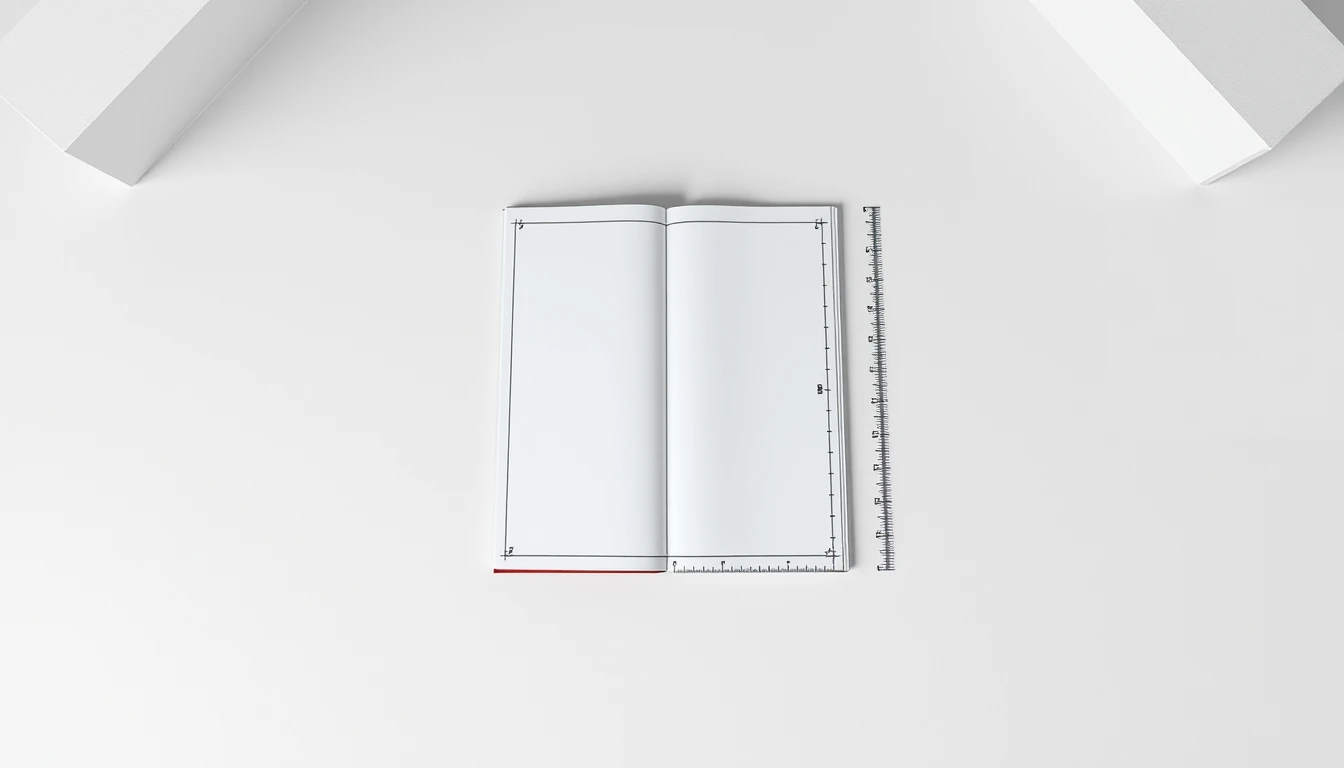
Print drop caps live or die on precision. A Kindle reflow engine forgives a 2pt baseline error. A KDP print file does not. At 6x9" trim with a 0.5" gutter margin, a three-line drop cap occupies roughly 0.42" vertically, and any misalignment shows up as a visible crack in the paragraph block. Here is the exact setup, tool by tool.
Adobe InDesign: The Professional Path
InDesign treats drop caps as a paragraph-level attribute with character-level styling. That separation is why it wins.
- Open the Paragraph Style. Window > Styles > Paragraph Styles. Double-click your body text style (or create "Body-DropCap" as a child style to avoid contaminating your master).
- Navigate to "Drop Caps and Nested Styles." This panel sits inside the Paragraph Style Options dialog. Set Lines to 3 and Characters to 1. Do not leave Characters blank — InDesign defaults to 1 but a stray value breaks every chapter open.
- Build a dedicated Character Style. Click New Character Style, name it "DropCap-3L." Set your serif display face (e.g., Playfair Display 42pt), Baseline Shift to -8pt, and a color tint (85% K or your brand spot). The negative shift pulls the glyph down so its baseline aligns with the third line's baseline.
- Assign the Character Style in the Drop Caps panel's "Character Style" dropdown. InDesign now applies it automatically to the first character of every paragraph using this style.
- Add a Nested Style for Small Caps. In the same dialog, click "New Nested Style." Choose "Small Caps" as the character style, then set the trigger to 3 Words via the "through" dropdown. The first three words render in small caps, creating the classic opening-line treatment.
Pro move: Set the paragraph's Space Before to 0 and First Baseline Offset to "Cap Height." This locks the drop cap flush to the top margin line, eliminating the micro-gap that plagues amateur print files.
Microsoft Word: The Fast, Flawed Route
Word can produce a passable drop cap. It cannot produce a production-grade one. Still, here is the correct sequence.
- Insert > Drop Cap > Dropped. Word inserts the cap into a text frame anchored to the paragraph.
- Drop Cap Options. Set Lines to drop: 3. Set Distance from text: 0.05 inches. Anything wider than 0.08" creates an awkward visual canyon at 6x9".
- Manual small caps. Highlight the first 4 words, then Font dialog (Ctrl+D) > check Small Caps. Word has no nested style engine, so this is a hand edit on every chapter open.
Why Word Falls Short for Print
| Issue | Word Behavior | InDesign / BooklierAi |
|---|---|---|
| Frame anchoring | Floats; shifts on reflow | Locked to paragraph style |
| Baseline control | No numeric shift | Exact pt-level shift |
| Nested styling | Manual per chapter | Automatic, rule-based |
| PDF/X-1a export | Color shifts, no bleed control | Native, print-certified |
Word's drop cap frame sits in a separate text layer. Move a paragraph, and the cap migrates. Export to PDF and the frame can clip at trim. For a 6x9" KDP interior, that means rejections or, worse, a printed book with a floating letter on page 47.
BooklierAi sidesteps both tools. It generates the InDesign-equivalent structure — locked character styles, calculated gutter margins, and 3-line caps — then outputs a PDF/X-1a file with correct spine width for your page count. No manual nested styles. No drifting frames. The kdp drop caps formatting rules are enforced at the engine level, not by hand.
If you must use Word, budget 20 minutes per chapter open for QA. If you use InDesign, budget five minutes total. If you use BooklierAi, budget zero — the cap is baked into the template before you upload.
Troubleshooting Drop Cap Bugs: Quotes, Numbers, and Awkward Letters
Troubleshooting Drop Cap Bugs: Quotes, Numbers, and Awkward Letters
Most drop cap failures aren't software failures. They're typographic decisions made too fast. Three edge cases account for nearly every broken chapter opener I've seen in 15 years of print production: opening quotation marks, difficult letterforms, and numerals. Get these right and your chapter openers look professionally typeset. Get them wrong and readers notice immediately, even if they can't name the problem.
Rule 1: Never Drop an Opening Quotation Mark
When a chapter opens with dialogue, the quotation mark is punctuation, not a letter. Dropping it creates a floating comma-like glyph that destroys the optical line. Publishers follow one of two standards:
- Omit the mark entirely. The dropped letter carries the visual weight. This is the dominant trade fiction convention.
- Hang it into the outer margin. The quote sits flush in the margin, outside the text block, aligned optically with the cap's left edge.
Never drop the quote and the letter together, and never push the mark into the indent. For a 6×9" page with a 0.75" outer margin, a hung quote typically sits 6–8 points into the margin. Anything more and it risks the trim line on print, or gets clipped on reflowable Kindle where margins collapse unpredictably.
Rule 2: Compensate for Awkward Letterforms
Four letters cause the most trouble: A, J, Q, and T. Each creates a specific optical gap.
| Letter | Problem | Fix |
|---|---|---|
| Q | Descending tail cuts into line 2, creating a visual collision | Reduce the drop cap 1–2 pt below the body size ratio, or nudge line 2 right by 4–6 pt |
| T | Crossbar leaves a gap between the cap and line 2 text | Negative-track the first line 5–10 units so text tucks under the bar |
| A | Diagonal strokes create a triangular void on the right | Apply optical kerning; widen the first-line indent by 2–3 pt |
| J | Descender hooks left, colliding with the margin or prior text | Shift the cap 2–4 pt right; verify descender clears the text block edge |
The core principle: drop caps are optical, not mathematical. A "Q" set to the same 3-line depth as an "M" will look wrong because the tail extends past the baseline. Adjust by eye, then verify in a printed proof. Screen rendering lies about optical weight.
Rule 3: Spell Out Numbers
Chapters that open with "1984" or "7" present a problem no kerning fixes. Numerals have uniform stroke weight and flat terminals. They read as data, not prose. A dropped "7" looks like a page number or a list marker. A dropped "1984" forces four glyphs into a single drop cap slot, which breaks the three-line rhythm entirely.
The publisher standard is unambiguous: spell the number out. "1984" becomes "NINETEEN EIGHTY-FOUR" with the "N" dropped, or the opening line is rewritten to start with a word. "7" becomes "SEVEN." This isn't stylistic preference—it's consistency. Drop caps signal the start of narrative prose, and numerals break that contract.
One exception: if the number is a proper noun or title (a year used as a chapter name), set it as a display line above the drop cap text rather than dropping a numeral.
How BooklierAi Handles This Automatically
BooklierAi applies these rules at the typesetting engine level, not as manual fixes:
- Detects opening quotation marks and omits them in reflowable ePub 3, hangs them in print PDF/X-1a
- Applies per-glyph optical kerning tables for A, J, Q, and T
- Flags numeral-initial chapters and prompts for spelled-out alternatives
- Recalculates gutter margins so dropped caps never crowd the spine on 6×9" trade paperbacks
The result: chapter openers that survive both the printing press and the Kindle reflow engine without a single manual correction. That's the standard kdp drop caps formatting rules demand, and it's built in by default.