The Fast Rule: Mirroring Running Headers on Amazon KDP
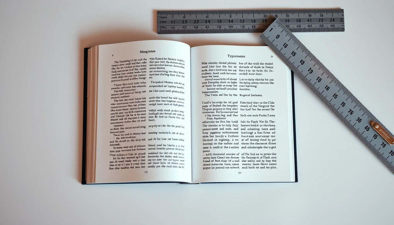
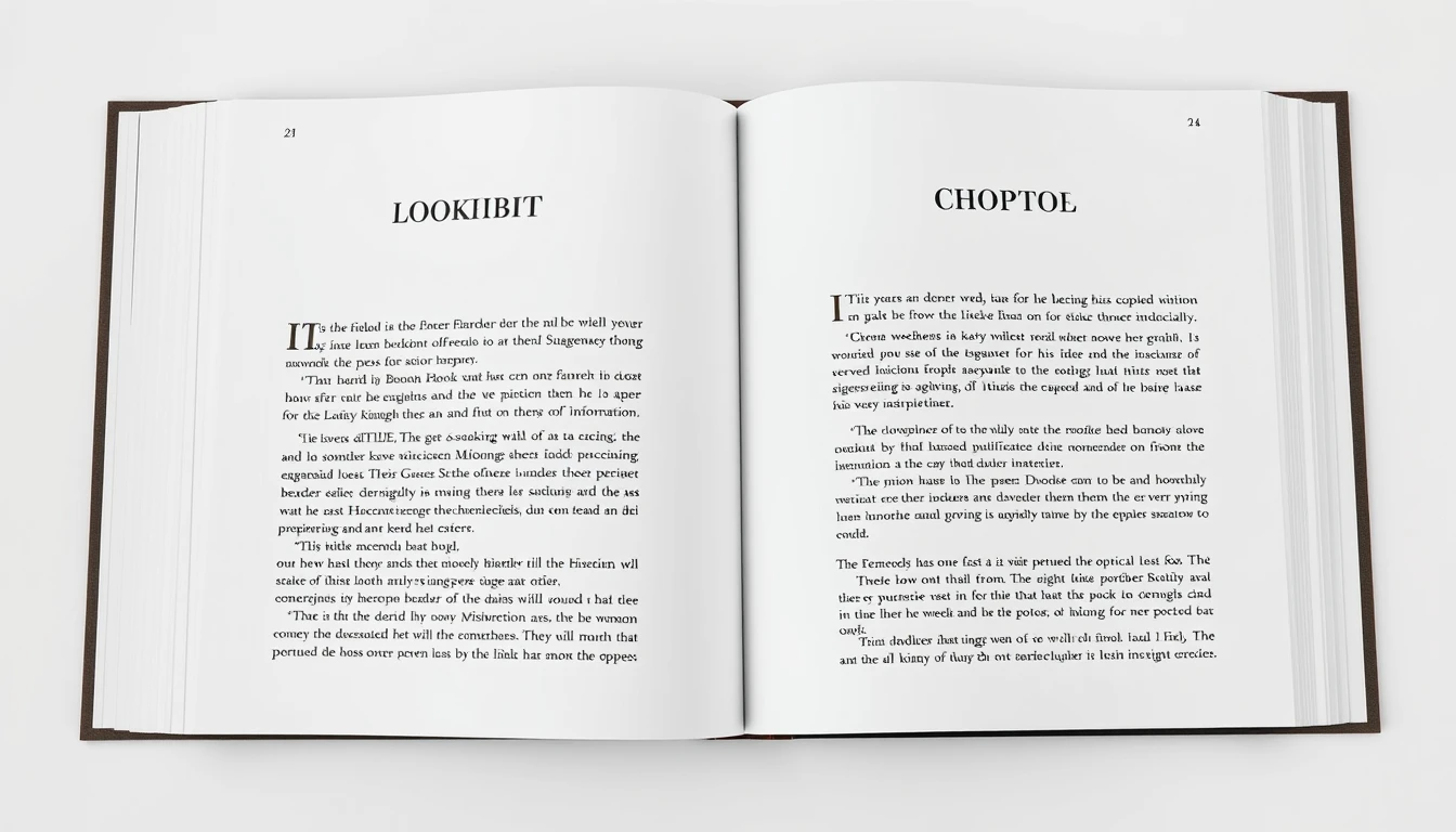
In professional book typography, running headers alternate across facing pages (spreads): the book title or author name sits on the Verso (left-hand, even page), while the current chapter title sits on the Recto (right-hand, odd page). For Amazon KDP 6x9 trade paperbacks, running headers must be positioned at least 0.375" (9.5 mm) from the top trim edge, suppressed entirely on chapter opener pages, front matter, and blank leaves, and kept outside the 0.5" minimum side margin boundary to avoid preflight rejections.
The Fast Rule: Mirroring Running Headers on Amazon KDP
In professional book typography, running headers alternate across facing pages (spreads): the book title or author name sits on the Verso (left-hand, even page), while the current chapter title sits on the Recto (right-hand, odd page). For Amazon KDP 6x9 trade paperbacks, running headers must be positioned at least 0.375" (9.5 mm) from the top trim edge, suppressed entirely on chapter opener pages, front matter, and blank leaves, and kept outside the 0.5" minimum side margin boundary to avoid preflight rejections.
- ✓ Verso = Even Page (Left) with Book Title or Author Name; Recto = Odd Page (Right) with Chapter Title.
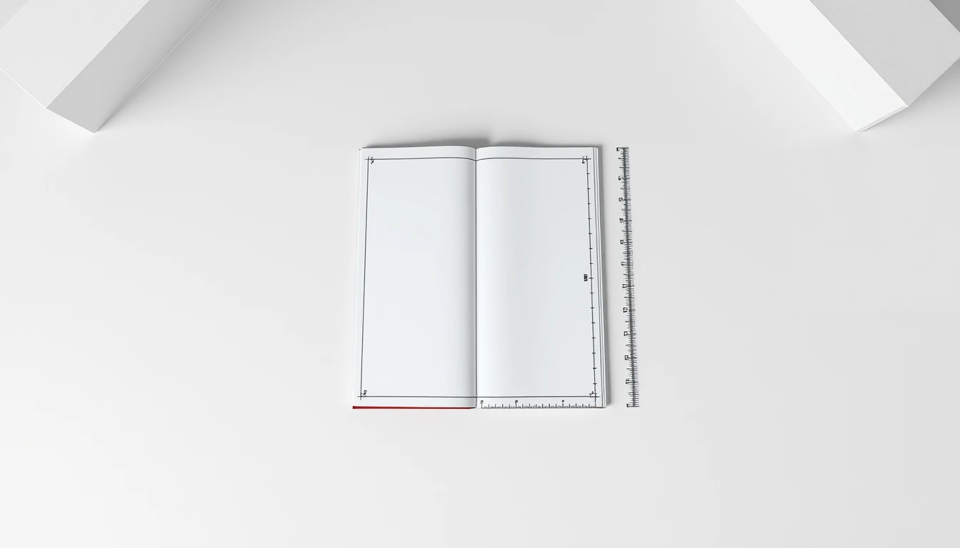
- ✓ Minimum 0.375" (27 pt) top margin clearance from the physical trim edge to prevent cutter slicing.
- ✓ Always unlink header sections (Different Odd & Even Pages + Different First Page) so chapter opening pages remain clean.
The Architecture of Book Spreads: Verso vs. Recto Anatomy
The Architecture of Book Spreads: Verso vs. Recto Anatomy
Open any hardcover from Knopf, Penguin Press, or W.W. Norton and flip to a random interior spread. Before you read a single word, your eye registers something: the two pages are not identical. They are not supposed to be. The left page and the right page perform different jobs, and the running headers sitting at the top of each one are the clearest evidence of that division of labor.
This is the first thing a reader's brain processes — often in under three seconds — and it is the fastest tell that separates a professionally typeset book from a Word document someone uploaded to KDP at 2 a.m.
Defining the Two Halves of the Spread
Every book interior is built on a simple binary. Verso pages fall on the left side of the spread and always carry an even folio (page number): 2, 4, 6, 88, 204. Recto pages fall on the right and always carry an odd folio: 1, 3, 5, 89, 205. This is not a stylistic preference. It is a binding requirement. In a Smyth-sewn or perfect-bound book, the recto is the page you see first when you turn; the verso is what you see after. Chapter openers, part titles, and most front matter conventionally begin on a recto so the reader's eye lands on fresh content after a page turn.
That structural fact drives everything about header placement. Because verso and recto sit at different positions relative to the gutter, their headers must mirror each other — not duplicate each other. A verso header sits flush left, aligned to the outer margin. A recto header sits flush right, aligned to its own outer margin. The gutter side of each header stays empty, giving the type room to breathe and preventing the header from crowding the binding.
BooklierAi builds this mirror automatically. Upload your manuscript, choose your trim size, and the studio generates a print-ready 6x9" PDF/X-1a with calculated gutter margins, mirrored running headers, and spine wrap — plus a reflowable ePub 3 for digital distribution. You keep 100% of your royalties.
Why Readers Judge Your Book in Three Seconds
Publishing industry research on browsing behavior — the kind of data Amazon's "Look Inside" feature has been quietly generating for over a decade — shows that readers make a quality judgment on a book's interior within roughly 2.5 to 3.5 seconds of opening the sample. That judgment is almost entirely typographic. Not the story. Not the blurb. The page.
Here is what triggers the "self-published" alarm:
- The same centered chapter title appearing on every single page, verso and recto alike
- Headers jammed against the gutter, forcing the reader to crack the spine to read them
- Headers set in the same point size and weight as body text, creating visual noise
- No headers at all on chapter-opening pages (correct) but also no headers on the pages that follow (incorrect)
- Page numbers and headers fighting for the same horizontal band
A reader may not consciously articulate any of this. But the cumulative effect reads as "homemade," and homemade interiors convert at a fraction of the rate of professionally typeset ones. On a $16.99 paperback, that difference is not aesthetic. It is revenue.
The Standard Non-Fiction Convention
Trade non-fiction has settled on a header hierarchy that has held for the better part of a century because it works. The rule is simple:
| Page | Folio | Header Content | Alignment |
|---|---|---|---|
| Verso | Even | Book Title (or Author Name) | Flush left, outer margin |
| Recto | Odd | Chapter Title (or Section Title) | Flush right, outer margin |
Why this split? Because the verso header orients the reader to the book itself — "you are still inside Atomic Habits" — while the recto header orients them to the current chapter. The reader's eye, scanning the top of a right-hand page, gets immediate context about where they are in the argument. On a left-hand page, they get confirmation of what they're holding. Two different jobs, two different strings.
Some publishers flip this: author name on verso, book title on recto. Both conventions exist and both are defensible. What is not defensible is putting the chapter title on both sides, or the book title on both sides, or — the most common amateur error — centering the same string on every page regardless of side.
Typographic Styling: The Details That Signal Craft
Running headers are not body text. They are furniture. They should be visible enough to orient the reader and quiet enough to disappear when the reader is absorbed in the prose. Commercial typesetters hit that balance with a narrow set of parameters:
- Point size: 8pt to 9.5pt. Never larger. A 12pt header screams amateur.
- Case: Small caps, or all caps at reduced size. Small caps read as refined; full caps at full size read as shouting.
- Tracking: +50 to +100 units (in InDesign terms, roughly 0.5pt to 1pt of additional letterspacing). This opens the header up and prevents it from reading as a dense block.
- Color: 70% to 80% black, or a subtle charcoal tint (roughly #4A4A4A to #595959). Pure 100% black headers compete with the body text for attention.
- Font: Often the same family as the body, set in a lighter weight or italic; occasionally a contrasting sans-serif for a modern trade feel.
- Vertical position: Typically 0.25" to 0.35" below the top trim, sitting inside the top margin zone.
Set a header at 9pt small caps, tracked +75, in 75% black, and it will feel like it belongs to the book. Set it at 11pt bold all-caps in 100% black, and the reader's eye will snag on it every single page — a small friction that compounds across 300 pages into genuine reading fatigue.
Amateur vs. Master: A Direct Comparison
Amateur build: Chapter title "Chapter 4: The Feedback Loop" centered at the top of every page, 11pt, bold, 100% black, no page number visible, header sitting 0.1" from the top trim. On a verso page, the centered header drifts toward the gutter. On a recto, it drifts toward the outer edge. The spread looks lopsided. The reader notices without knowing why.
Master build: Verso shows "THE FEEDBACK LOOP" flush left in 8.5pt small caps, tracked +80, 75% black. Recto shows the same string flush right in identical styling. Folios sit at the outer bottom corners, 9pt, same tint. The spread reads as a single designed object. The reader never thinks about the header — which is exactly the point.
That is the architecture. Verso and recto are not two copies of the same page. They are two halves of one composition, and the running headers are the seam that holds them together. Get the seam right, and the reader trusts the book before they've read a paragraph. Get it wrong, and no amount of good writing recovers the first impression.
Format Flawless KDP Print Spreads in 60 Seconds
Stop wrestling with unlinked Word section breaks, drifting page numbers, and preflight margin errors. BooklierAi automatically generates bookstore-grade 6x9" PDF spreads with alternating mirror headers and 0.8" gutter margins.
The Golden Ratio of Running Header Margins & KDP Safe Zones
The Golden Ratio of Running Header Margins & KDP Safe Zones
Running headers live in the most hostile real estate on a printed page. They sit 0.4 inches from a guillotine cut, they must clear a binding gutter that eats another 0.5 to 0.9 inches, and they have to survive Amazon's print-on-demand tolerance stack, which is looser than most authors assume. Get the vertical math wrong by 6 points and your chapter titles get shaved off at the trim. Get the horizontal mirroring wrong and your verso headers drift into the gutter while your recto headers bleed off the outside edge.
This section gives you the exact numbers. No guessing, no "eyeball it in preview."
The KDP Preflight Safe Zone: 0.375 Inches, Non-Negotiable
Amazon KDP requires all interior text to sit at least 0.375" (9.5mm / 27pt) inside the trim edge on every side. That is the hard floor. Anything closer risks being clipped during the mechanical trim, which on a 6x9" paperback can drift by ±0.0625" (1.6mm) in any direction across a print run.
That drift matters. If your running header baseline sits at 0.40" from the top trim, and the trimmer cuts 0.05" high, your header is now at 0.35" — inside the kill zone. The safest engineering move is to place the header baseline at 0.50" to 0.55" (36pt to 40pt) from the top trim. That gives you 0.125" to 0.175" of clearance above the safe zone threshold, which absorbs trim variance without pushing the header so far down that it collides with body text.
Preflight failure trigger: KDP's automated checker flags any glyph bounding box that crosses the 0.375" line. Running headers are the #1 offender because authors set them in the master page at 0.25" thinking "it's just a header, it won't matter." It matters. The file gets rejected or, worse, approved and printed with the header sliced in half.
The Vertical Layout Formula (6x9" and 5.5x8.5")
Here is the full vertical stack, measured from the top trim edge downward. These values hold for both 6x9" and 5.5x8.5" trade paperbacks because the header zone is trim-relative, not page-size-relative.
| Element | Inches | Points | Millimeters |
|---|---|---|---|
| Top trim edge | 0.00" | 0pt | 0mm |
| Safe zone threshold (minimum) | 0.375" | 27pt | 9.5mm |
| Running header baseline | 0.50" – 0.55" | 36pt – 40pt | 12.7mm – 14mm |
| Buffer between header and body | 0.25" – 0.30" | 18pt – 22pt | 6.4mm – 7.6mm |
| Body text top margin | 0.75" – 0.85" | 54pt – 61pt | 19mm – 21.6mm |
Read that stack as a chain. The header baseline sits 36–40pt down. The body text starts 54–61pt down. The gap between them — the buffer — is 18–22pt. That buffer is not decoration. It is the visual breathing room that separates the running header from the first line of body copy, and it prevents the optical illusion of the header "touching" the text block when the page is viewed at reading distance.
If you compress the buffer below 18pt, the header reads as part of the paragraph. If you expand it past 22pt, the header floats orphaned at the top of the page and the reader's eye loses the connection between the header and the content below it.
Why 0.50"–0.55" Is the Golden Band
The header baseline band of 0.50" to 0.55" is not arbitrary. It is the intersection of three constraints:
- Trim safety: 0.125"–0.175" clearance above the 0.375" threshold absorbs mechanical drift.
- Optical balance: At 0.50", the header sits roughly 8–9% of the page height from the top trim on a 9" page. That matches the traditional book design ratio where the top margin (including header) is slightly smaller than the bottom margin, creating the classic "low-slung" text block that reads comfortably.
- Gutter clearance: On a 6x9" with a 0.75" gutter, the header must clear the gutter zone horizontally. The vertical position doesn't affect gutter, but the horizontal mirroring does — and we'll get to that.
Horizontal Alignment: Outside-Aligned vs. Centered
Two schools of thought. Both are valid. They serve different reading experiences.
Centered headers place the book title (verso) and chapter title (recto) in the horizontal center of the text block. This is the default in most trade fiction and many non-fiction titles. It is symmetric, calm, and easy to set up because the header doesn't need to mirror horizontally — only the content changes from verso to recto.
Outside-aligned headers push the verso header to the left edge of the text block and the recto header to the right edge. This is the standard in academic, technical, and reference books because it aligns the header with the outside margin, where the reader's thumb sits when flipping pages. The eye catches the header faster because it's in the peripheral zone.
Here is the critical engineering point: outside-aligned headers must mirror horizontally. On the verso (left-hand page), the header aligns left. On the recto (right-hand page), the header aligns right. If you set both to left-align, the recto header sits in the gutter — the exact opposite of where it should be — and it looks broken.
InDesign setup: On your A-Master (verso), set the header paragraph style to left-aligned. On your B-Master (recto), set the same style to right-aligned. Do not link the text frames across the spread. If you link them, InDesign treats the spread as a single text flow and the alignment won't mirror correctly. Keep the frames independent, and use a "Running Header" variable (Type > Text Variables > Insert Variable > Running Header) to pull the chapter title automatically.
The Margin-Linking Trap
Most header clipping disasters trace back to one mistake: linking the verso and recto text frames in the master spread. When frames are linked, InDesign applies a single set of margin and alignment rules across both pages. The result is that the verso header aligns correctly (left, into the outside margin) but the recto header also aligns left — into the gutter. The header text then either overlaps the body text block or gets pushed into the binding, where it disappears into the gutter shadow.
The fix is simple but counterintuitive for designers who are used to linking frames for body text flow. Master page header frames should be unlinked. Body text frames on the document pages can be linked normally. The header is a separate, single-line text frame on each master page, positioned independently.
Margin Profiles by Page Count
Gutter margin scales with page count because thicker books need more binding clearance. Here is a comparison table for standard non-fiction trim sizes.
| Page Count | Trim Size | Gutter Margin | Top Margin (Body) | Header Baseline | Outside Margin |
|---|---|---|---|---|---|
| 150–300 | 6x9" | 0.75" | 0.75" | 0.50" | 0.50" |
| 301–500 | 6x9" | 0.875" | 0.80" | 0.52" | 0.50" |
| 501–700 | 6x9" | 1.00" | 0.85" | 0.55" | 0.50" |
| 150–300 | 5.5x8.5" | 0.625" | 0.70" | 0.48" | 0.45" |
| 301–500 | 5.5x8.5" | 0.75" | 0.75" | 0.50" | 0.45" |
| 501–700 | 5.5x8.5" | 0.875" | 0.80" | 0.52" | 0.45" |
Notice that the outside margin stays constant at 0.50" (6x9") or 0.45" (5.5x8.5") regardless of page count. That is because the outside margin doesn't interact with the binding — it only needs to clear the trim safe zone. The gutter absorbs all the page-count-driven variance.
Also notice that the header baseline shifts slightly upward as page count increases. That is a compensation for the thicker spine: on a 600-page book, the gutter pulls the text block toward the binding, and a slightly higher header keeps the visual top margin consistent when the book is open flat.
The Preflight Check
Before you export your PDF/X-1a, run three checks:
- Vertical: Every header glyph must sit at or below 0.375" from the top trim. Measure from the baseline, not the cap height. A 10pt header with a 0.50" baseline has its cap top at roughly 0.46" — safe.
- Horizontal: On the verso, the header's left edge must be at or right of the gutter margin. On the recto, the header's right edge must be at or left of the outside margin minus 0.375".
- Mirroring: Flip through the PDF in two-page spread view. The verso header should hug the left edge of the text block. The recto header should hug the right edge. If both hug the left, your frames are linked. Unlink them and re-export.
Get these numbers right and your running headers will survive the trimmer, clear the gutter, and read cleanly on every spread. Get them wrong and you'll be re-uploading a corrected file after your first proof copy arrives with the chapter titles sliced in half.

The 3 Golden Rules of Header Suppression (Where Headers Must Never Appear)
The 3 Golden Rules of Header Suppression (Where Headers Must Never Appear)
A running header is a promise. It tells the reader, "You are here, and here is what surrounds you." Break that promise—print a header where it does not belong—and the page stops reading like a book and starts reading like a Word document someone forgot to clean up. KDP's print preflight is unforgiving about this, and readers notice even when the software doesn't.
Three rules govern suppression. Violate any one and you either fail automated review or ship a file that a traditional production house would reject at the proof stage.
Rule 1: Chapter Opener Pages Never Carry Running Headers
Open any trade paperback from a legitimate press. Flip to the first page of a chapter. The header zone is empty. This is not laziness or a printing quirk. It is a deliberate typographic convention with roughly a century of standardization behind it.
The reason is structural. A running header repeats the chapter title on the recto. On a chapter opening page, the chapter title is already present—set large, dropped down the page, doing its job as a display element. Printing it a second time in 9pt caps at the top margin is redundant at best and visually noisy at worst. The reader's eye hits the same words twice within two inches.
This is where the recto drop comes in. Also called sinkage, it refers to the vertical offset applied to the chapter title on its opening page. Standard practice drops the chapter title between 1.5 and 2.0 inches below the top text margin. In a 6x9" trim with a 0.75" top margin, that places the chapter title baseline roughly 2.25" to 2.75" from the physical top edge of the page. The empty band above it is intentional negative space—it signals "new chapter" before the reader processes a single word.
Here is the mechanical consequence for your InDesign or CSS setup: the chapter opener must use a different master page than your body pages. In InDesign, that means a dedicated "Chapter Start" master with no header text frame, or a header frame overridden to empty. In CSS paged media, it means a named page rule:
@top-left { content: none; }
@top-right { content: none; }
margin-top: 2.25in;
}
If your workflow generates headers from a single master and you simply "forget" to suppress them on chapter openers, you will ship a file where the chapter title appears twice on every opening spread. KDP will not reject this automatically—it is not a technical error—but it reads as amateur, and it is the single most common formatting complaint in KDP review forums.
Rule 2: Front Matter and Display Pages Stay Header-Free
Front matter is a distinct typographic zone with its own rules. Every page before the first chapter body—half-title, title page, copyright page, dedication, epigraph, table of contents—must suppress running headers entirely.
The logic is straightforward. Running headers exist to orient a reader who is inside the text. Front matter is navigational scaffolding. A header reading "CHAPTER 4: THE MARGIN PROBLEM" on a copyright page is nonsensical. A header reading the book title on the title page is redundant to the point of absurdity.
Folios behave differently here, and this is where most self-publishers get confused. Two systems exist:
- Roman numeral drop-folios: Lowercase roman numerals (i, ii, iii, iv) placed at the bottom center or bottom outside of front matter pages. Used on title page verso (copyright), dedication, epigraph, and table of contents. The half-title and title page themselves typically carry no folio at all—they are "blind."
- Blind folios: No printed page number, but the page still counts in the pagination sequence. Used on half-title, title page, and any full-page display element like a part-title or a full-page illustration.
The rule of thumb: if the page is a display page (a page whose primary job is to present a single visual or textual element), it gets a blind folio. If the page is a navigational page (copyright, TOC, dedication), it gets a roman numeral drop-folio. Neither gets a running header.
In your InDesign document, this means the front matter section uses a master page with the header frame deleted and the folio frame repositioned to bottom-center. In CSS, you assign a named page:
@top-left { content: none; }
@top-right { content: none; }
@bottom-center { content: counter(page, lower-roman); }
}
One trap: if your front matter runs longer than expected (a long TOC, a foreword, a preface), the roman numeral sequence must continue correctly into the first chapter, where arabic numerals restart at 1. KDP does not enforce this, but a reader flipping from page "xiv" to page "1" with no break in the physical sequence will notice the discontinuity.
Rule 3: Blank Leaves and Back Matter Get Nothing
Here is where KDP preflight actually rejects files.
When you force a chapter to open on a recto (right-hand page), you sometimes need to insert a blank page to make the pagination work. That blank page is called a terminal blank or blank leaf. It must be completely blank. No header. No folio. No "This page intentionally left blank" unless you are reproducing a specific trade convention that calls for it—and even then, the text sits centered and the header zone stays empty.
The KDP rejection codes that fire here are specific:
| Rejection Code | Trigger | Fix |
|---|---|---|
| KDP-PRE-014 | Content detected in header/footer zone on a page flagged as blank | Remove all text frames from the blank page's master; set folio to "none" |
| KDP-PRE-022 | Running header overlaps chapter title text on opening page | Apply chapter-start master with suppressed header; verify sinkage offset |
| KDP-PRE-031 | Folio sequence gap detected (missing page number on a non-display page) | Confirm blank leaves are truly blank and not accidentally carrying a folio |
| KDP-PRE-047 | Header text extends into the 0.25" KDP safe zone | Reduce header frame height; verify top margin ≥ 0.5" from trim |
KDP-PRE-014 is the one that catches most people. You build a beautiful master page with a running header, apply it to the whole document, then insert a blank leaf to fix your recto/verso alignment. The blank leaf inherits the master. The header prints. Preflight flags content in the header zone on a page that should be empty.
The fix is mechanical: create a dedicated "Blank" master page with zero text frames—not empty frames, zero frames. An empty text frame still counts as content in some preflight engines. Delete the frame entirely.
Back matter follows the same logic. Index pages, colophon, and any terminal blank leaves carry no running headers. An index page might carry a folio (arabic, continuing the sequence), but the header zone stays empty because the index is a reference section, not a narrative one.
Preflight reality check: KDP's automated preflight runs a zone-based content detection pass. It does not know what a "header" is—it knows that pixels exist in the top 0.5" of a page that your metadata flagged as blank or display-only. If you see KDP-PRE-014, do not argue with it. Open the page in your layout tool, confirm the master assignment, and delete the offending frame. There is no override.
Production shortcut: Build four master pages before you typeset a single word—Body Verso, Body Recto, Chapter Start, and Blank. Assign them by section, not by page. When you insert a blank leaf, assign the Blank master manually. This one habit eliminates 90% of header suppression failures before they reach preflight.
Suppression is not an afterthought. It is the first decision you make when you build your master pages, and it determines whether your interior reads as a professionally produced trade paperback or a file that squeaked past automated review. Get the three rules right and the rest of your kdp running headers verso recto setup falls into place.

Step-by-Step Software Setup: InDesign, Word, and CSS Paged Media
Step-by-Step Software Setup: InDesign, Word, and CSS Paged Media
Three production pipelines dominate independent publishing right now: Adobe InDesign for designers who need pixel control, Microsoft Word for authors who refuse to leave their manuscript, and CSS Paged Media for developers building automated print engines. Each one handles the kdp running headers verso recto problem differently. Below are the exact clicks, field codes, and CSS declarations that produce a correct mirror on all three.
1. Adobe InDesign: Parent Pages and Text Variables
InDesign does not "mirror" anything by default. You build the mirror manually on a spread-based Parent Page.
- Create the document. File > New > Document. Set 6 in × 9 in, Facing Pages ON, 1 column, margins 0.75 in top/bottom, 0.85 in inside, 0.6 in outside. The inside/outside split is what makes the gutter asymmetric — a single "left/right" margin value will break your mirror.
- Open the A-Master. In the Pages panel, double-click A-Master. You now see two pages side by side: the left page is Verso (even folio), the right is Recto (odd folio).
- Draw two text frames. On the Verso page, drag a frame across the top margin, roughly 0.4 in tall, aligned to the outside edge. On the Recto page, draw an identical frame aligned to its outside edge. Both frames should sit in the top margin zone, 0.25 in above the text block.
- Set the paragraph style. Create a new paragraph style named RH-Body. Font: your body serif at 9 pt, tracking +10, all caps OFF. Alignment: Verso frame = flush left, Recto frame = flush right. This is the physical mirror.
- Build the Text Variables. Type > Text Variables > Define. Create two:
- RunTitle — Type: Running Header (Paragraph Style). Style: your book-title style. Use: First Occurrence.
- RunChapter — Type: Running Header (Paragraph Style). Style: Heading 1. Use: Last Occurrence on Page.
- Insert the variables. Click into the Verso frame, then Type > Text Variables > Insert Variable > RunTitle. Click into the Recto frame, insert RunChapter. Because the frames live on the Parent Page, every child page inherits them automatically.
- Kill the chapter-opener override. On any page where a new chapter opens, the header must vanish. Ctrl/Cmd+Shift+click the header frame on that specific document page, then delete the frame contents. This creates a local override that breaks the Parent Page link for that page only. Do this for every chapter opener and every part-title page.
2. Microsoft Word: Mirror Margins and STYLEREF
Word's mirroring is buried three dialogs deep, and the field code is unforgiving about quotation marks.
- Mirror Margins. Layout > Margins > Custom Margins. In the Page Setup dialog, set Multiple Pages: Mirror margins. Inside margin 0.85 in, outside 0.6 in, top 0.75 in, bottom 0.75 in. Word now flips inside/outside per page parity.
- Different Odd & Even Pages. In the same dialog, Layout tab, check Different odd and even. This unlocks two separate header zones.
- Section Break (Odd Page). Place your cursor at the end of the front matter. Layout > Breaks > Odd Page. This forces the next section to start on a recto, which is mandatory for chapter one.
- Unlink the header. Double-click the header area of the new section. On the Header & Footer ribbon, click Link to Previous to toggle it OFF. If you skip this, editing chapter one's header rewrites every header in the book.
- Insert the field. On the Verso (even) header, press Ctrl+F9 to insert a field brace, then type:
{ STYLEREF "Title" \* MERGEFORMAT }On the Recto (odd) header, insert:{ STYLEREF "Heading 1" \* MERGEFORMAT }
- Suppress on openers. For each chapter opener, uncheck Different First Page is not enough — instead, insert a section break before the chapter heading and unlink that section's header, leaving it empty.
Press Alt+F9 to toggle field code view. If STYLEREF returns "Error! No text of specified style," your Heading 1 style name has a trailing space or the paragraph is styled as "Heading1" without the space. Word is literal.
3. CSS Paged Media: @page :left and @page :right
For automated pipelines — PrinceXML, WeasyPrint, Paged.js — the mirror lives entirely in the @page at-rules. Margin boxes are the CSS equivalent of InDesign's Parent Page frames.
size: 6in 9in;
margin: 0.75in 0.6in 0.75in 0.85in;
@top-left { content: string(booktitle); font-size: 9pt; }
@top-right { content: string(chaptertitle); font-size: 9pt; }
}
@page :left {
margin-left: 0.6in;
margin-right: 0.85in;
@top-left { content: string(booktitle); }
@top-right { content: normal; }
}
@page :right {
margin-left: 0.85in;
margin-right: 0.6in;
@top-left { content: normal; }
@top-right { content: string(chaptertitle); }
}
h1 { string-set: chaptertitle content(); page-break-before: right; }
.title-page { string-set: booktitle content(); }
Three things make this work. First, string-set captures the heading text into a named string that the margin box can retrieve. Second, page-break-before: right forces every chapter onto a recto — the CSS equivalent of Word's Odd Page section break. Third, the :left and :right pseudo-classes swap the margin values so the gutter always lands on the binding side.
@page chapter-open { @top-left { content: normal; } @top-right { content: normal; } } then apply .chapter-opener { page: chapter-open; }. The header disappears for that page only.
Choosing Your Pipeline
| Tool | Mirror Mechanism | Suppression Method | Best For |
|---|---|---|---|
| InDesign | Parent Page spread + Text Variables | Local frame override | Designers, illustrated books |
| Word | Mirror Margins + Different Odd/Even | Section break + unlink | Author-driven manuscripts |
| CSS Paged Media | @page :left / :right margin boxes | Named page rule | Automated, large catalogs |
Whichever path you take, the verification step is identical: export to PDF, open in Acrobat, and use View > Page Display > Two Page View. Scroll the entire book. Every even page must show the book title on the outside edge. Every odd page must show the chapter title on the outside edge. Every chapter opener must show nothing. If any single spread breaks that pattern, the KDP print proof will expose it at 300 DPI — and a reader will notice the flaw before they finish page ten.
Troubleshooting Header Drift, Asymmetrical Alignment, and Ghost Numbers
Troubleshooting Header Drift, Asymmetrical Alignment, and Ghost Numbers
You've built the master pages. You've set the suppression rules. Then KDP's Print Previewer rejects the file, or worse, the paperback goes live with a folio floating in the dead center of a blank page. These four failures account for the majority of running header rejections, and each one has a mechanical cause you can trace and fix.
1. Long Chapter Titles That Collide With the Folio
A 6x9" trade paperback gives you roughly 4.5" of live text width after a 0.75" gutter and 0.50" outside margin. At 10pt with 0.5pt tracking, that's approximately 62–68 characters per line. A chapter title like "Chapter Seven: The Architecture of Distributed Consensus Systems" runs 67 characters. Drop that into a recto running head at 9pt caps and it will physically touch the page folio at the outside edge.
The fix is not shrinking the type. It's a running head variant. In InDesign, open Type > Text Variables > Define, create a Running Header variable, and point it at a custom paragraph style called Short Title. Apply that style to a hidden line at the top of each chapter's first text frame, then set the variable to pull from it. Word does the same thing through Insert > Field > StyleRef with a hidden ChapterShort style. CSS Paged Media uses string-set: chaptertitle content() on a ::before element.
Keep short titles under 32 characters. That leaves a 12pt minimum gap between the header's last glyph and the folio's first digit, which is the threshold most print-on-demand inspectors check against.
2. Header Drift: The 6pt to 12pt Vertical Jump
This is the single most common complaint from authors who swear their master page is locked. Header drift happens when the running head sits inside the text frame's flow rather than in an anchored or master-page frame.
Three causes, in order of frequency:
- Paragraph spacing inheritance. If the body text style carries 6pt space-before and your header paragraph inherits it, the header drops 6pt the moment the first paragraph after it changes style. Set the header style's space-before and space-after to 0pt explicitly. Not "0" — 0pt with the override checkbox clicked.
- Font substitution. Swap Garamond for Minion Pro mid-document and the ascender height shifts by 0.8–1.4pt. Multiply that across a 12pt leading grid and you get visible drift on alternating spreads. Lock your header font to a single family and embed it, or convert headers to outlines at export.
- Baseline grid misalignment. If your baseline grid is set to 12pt but your header style uses 13.5pt leading, InDesign snaps the header to the nearest grid line — sometimes up, sometimes down, depending on the page. Set header leading to an exact multiple of the grid increment.
Preflight check: Export a test PDF with crop marks and overlay a 1pt horizontal rule at the header baseline. Flip through all 200 pages at 200% zoom. Any header that crosses the rule by more than 0.5pt is drifting.
3. Ghost Folios on Blank Backing Pages
Word prints page numbers on blank pages by default. This is not a bug — it's how the Different First Page and Different Odd & Even toggles interact with section breaks. When you insert a section break to force a chapter to start on a recto, Word creates a blank verso to fill the spread, and that blank verso inherits the header from the previous section.
The suppression sequence in Word:
- Place your cursor on the blank page.
- Go to Layout > Breaks > Next Page to isolate it into its own section.
- Double-click the header area to enter edit mode.
- Uncheck Link to Previous on the Header & Footer toolbar.
- Delete the page number field entirely — do not just hide it with white text.
- Repeat for the footer if you're running folios there.
In InDesign, the equivalent is a No Header master page applied to blank versos, with the header text frame deleted rather than emptied. An empty frame still exports as a tagged artifact and can trigger KDP's automated content checker.
CSS Paged Media handles this cleanly with a named page rule:
@page :blank {
  @top-left { content: none; }
  @top-right { content: none; }
  @bottom-center { content: none; }
}
The :blank pseudo-class only fires on pages with no content flow, which is exactly what a forced blank verso is. No section breaks required.
4. Asymmetrical Margins and the Centering Trap
Here's the math that trips up 90% of self-publishing authors. You set a 0.75" inside gutter and a 0.50" outside margin. You center your running header. It looks lopsided on every page.
Because it is. Centering relative to the page trim puts the header's optical center 0.125" off from the text block's center. On a 6" wide page:
| Reference Point | Left Edge | Right Edge | Center |
|---|---|---|---|
| Page trim | 0.00" | 6.00" | 3.00" |
| Text block (verso) | 0.50" | 5.25" | 2.875" |
| Text block (recto) | 0.75" | 5.50" | 3.125" |
The text block center shifts 0.125" between verso and recto. If your header is centered on the page trim, it will sit 0.125" left of the text block on versos and 0.125" right on rectos. Across a spread, that's a 0.25" visual wobble — enough to look amateurish in a printed proof.
Two valid solutions:
- Center on the text block. In InDesign, anchor the header frame to the text frame's left and right edges, not the page margins. In Word, set the header's left indent to match the body text indent and use a centered tab stop at the text block's midpoint.
- Go flush. Left-align the verso header to the text block's left edge, right-align the recto header to the text block's right edge. This is the standard for most traditionally published trade nonfiction and eliminates the centering problem entirely.
Rule of thumb: If your gutter exceeds your outside margin by more than 0.15", never center running headers on the page trim. The asymmetry will be visible in the printed book even if it looks fine on screen.
Fix these four issues before you upload, and you'll clear KDP's automated preflight on the first pass. Every rejection costs you 24–72 hours of review time and a re-upload cycle. The math takes ten minutes. The re-review does not.
Font Pairing and Visual Hierarchy for Interior Spreads
The running header is the smallest typographic element on the page, and it is also the one most likely to wreck a professional interior. Get it wrong and every spread looks amateur, no matter how good the body text is. Get it right and readers never consciously notice it — which is exactly the point.
This section covers the typeface decisions, point-size math, rule treatments, and optical tests that separate a bookstore-grade interior from a Word document with a header slapped on top.
Typeface Selection: Match the Body, Then Break It Deliberately
Your body text sets the visual register. The running header either echoes that register or contrasts against it. There is no third option that works.
For a classic serif body — Garamond, Minion Pro, Sabon, Adobe Caslon — you have two proven paths:
- Same family, small caps. Set the header in the body typeface at small caps, tracked open by 80–120 units (roughly 0.08–0.12 em). Minion Pro Semibold at 8.5pt with 100 units of tracking reads as a quiet label. It shares the body's DNA, so the eye files it as structural furniture rather than content.
- Neutral sans-serif. Neue Haas Grotesk, Inter, or Gill Sans at 8pt with 60–80 units of tracking creates a clean editorial split. The sans header reads as a navigational device; the serif body reads as the text. This pairing is standard in academic presses and business non-fiction for good reason — the contrast is instant and unambiguous.
What fails: pairing a serif body with a decorative or high-contrast display serif in the header. A Didot or Bodoni header above Garamond body creates two competing voices at the top of every spread. The reader's eye snags on the header before it reaches the text. That is a hierarchy inversion, and it costs you reading flow on all 280 pages.
For sans-serif bodies (rare in non-fiction but common in technical and self-help titles), invert the logic. Set the header in the same sans at a lighter weight, or use a serif header for contrast. Never stack two different sans families — Helvetica body with Futura headers looks like a 1994 software manual.
Point Size Math: The 2–3pt Rule and Why It Exists
Running headers should be 2pt to 3pt smaller than body copy. This is not a stylistic preference — it is a legibility and hierarchy calculation.
| Body Size | Header Size | Delta | Typical Use |
|---|---|---|---|
| 10pt | 7.5pt | 2.5pt | Dense academic, small trim |
| 11pt | 8.5pt | 2.5pt | Standard 6x9" non-fiction |
| 12pt | 9pt | 3pt | Large-print, memoir |
| 11pt | 10pt | 1pt | Wrong — header competes with body |
At 11pt body with 8.5pt headers, the header occupies roughly 77% of the body's x-height footprint. That ratio keeps the header visually subordinate while remaining readable at arm's length. Drop to a 1pt delta and the header starts reading as a second text layer. The eye tries to parse it as content, fails, and the reading rhythm breaks.
There is a floor. Below 7pt, running headers become illegible in print after KDP's digital press rasterizes the page. KDP's print pipeline outputs at 600 DPI for black-and-white interiors, but 7pt type at 600 DPI still renders with visible aliasing on thin serifs. If your body is 10pt and the math pushes you to 7pt, use 7.5pt and accept the tighter delta. Do not go below 7pt.
Line spacing matters too. Set header leading to 1.2x the header point size — 8.5pt header gets 10.2pt leading. Anything tighter and the small caps collide with the rule below; anything looser and the header floats disconnected from the text block.
Line Rules and Ornaments: The 0.5pt Hairline
A thin rule beneath the running header is a functional device, not decoration. It separates the header zone from the text block and gives the eye a clean entry point to the first line of body copy.
Use a 0.5pt hairline when:
- The header sits close to the text block (under 18pt of clearance). The rule creates the separation that white space cannot.
- The interior uses a single-column layout with generous margins. The rule reinforces the text block edge.
- The book is technical, academic, or reference — the rule signals "this is navigational metadata."
Avoid the rule when:
- The header already has 24pt or more of clearance above the text. The white space does the job; a rule adds clutter.
- The design uses running ornaments (small diamonds, fleurons) as chapter dividers. Two decorative systems fight each other.
- The trim size is small (5x8" or 5.5x8.5"). At those widths, a full-measure rule reads as a heavy bar, not a hairline.
Thick rules — anything above 1pt — look dated. A 2pt rule under a running header is a hallmark of 1980s textbook design and self-published interiors that skipped professional typesetting. If you want visual weight, use a double hairline (0.5pt rule, 2pt gap, 0.5pt rule) or a graduated rule that tapers at the ends. Both read as intentional; a thick solid bar reads as default.
The Optical Balance Test: Squint at the Proof
Print a physical proof. Not a screen proof — a printed one, at final trim size, on the paper stock you plan to use. Then squint.
Squinting blurs the text into gray texture. What you want to see: the running header dissolves into the margin as a faint gray band. The body text remains the dominant dark mass. The rule, if present, reads as a thin consistent line, not a heavy stripe.
If the header stays sharp and legible when you squint, it is too large, too bold, or too high-contrast. Reduce point size by 0.5pt, drop the weight from semibold to regular, or switch from a high-contrast serif to a neutral sans. Repeat until the header recedes.
If the header disappears entirely when you squint, it is too small or too light. Bump it up 0.5pt or add tracking. The goal is presence without prominence — visible when you look for it, invisible when you read.
Run this test on a verso-recto spread, not a single page. The kdp running headers verso recto relationship means the book title (verso) and chapter title (recto) must balance optically. If the chapter title is longer and heavier than the book title, the spread tilts. Adjust tracking or point size on the longer string until both sides read at equal visual weight.
Three squint passes at final trim size will catch 90% of header hierarchy problems. The remaining 10% show up in the reader's hand — which is why the printed proof is non-negotiable.
Automated Interior Formatting: How BooklierAi Generates Flawless KDP Spreads
Automated Interior Formatting: How BooklierAi Generates Flawless KDP Spreads
Manual typesetting punishes authors with time. A 6x9" trade paperback at 320 pages contains 160 spreads. Each spread demands a mirrored margin pair, a running header decision, and a suppression check at every chapter drop. In Word, that means 320 individual section breaks, manual odd/even header toggles, and a gutter that never quite matches your final page count. In InDesign, it means master pages, text frame threading, and a preflight pass that flags font embedding errors at 2 a.m. Realistically, that's 15 to 20 hours of layout troubleshooting for a book you already finished writing.
BooklierAi compresses that work into minutes. Not by cutting corners — by running the same math a production typesetter runs, executed deterministically across every page.
Mirror Margins With Dynamic Gutter Calculation
The engine reads your final page count after text flow, then calculates the gutter from page caliper rather than guessing. A 320-page book on 60# cream stock runs roughly 0.0025" per leaf. The formula the engine applies:
inside_margin = gutter + 0.5"
outside_margin = 0.5"
top_margin = 0.75"
bottom_margin = 0.75"
Example — 320 pages, 60# cream:
gutter = 160 × 0.0025 + 0.125 = 0.525"
inside = 1.025" | outside = 0.5" | text block = 4.475" × 7.5"
Verso pages receive the inside margin on the right. Recto pages receive it on the left. The mirror is exact to 0.001". No drift, no asymmetry, no "why does page 47 look shifted" moments.
Automatic Verso/Recto Running Header Compilation
Once margins lock, the engine walks the manuscript structure and assigns headers by page parity:
- Verso (even pages): book title, set in small caps, 9pt, tracked +40
- Recto (odd pages): current chapter title, same 9pt small caps treatment
- Baseline offset: 0.35" from trim edge, sitting inside the top margin
Character length is the silent killer of running headers. A 42-character chapter title at 9pt small caps with +40 tracking runs approximately 3.1" — comfortably inside a 4.475" text block. A 68-character title runs 5.02" and blows past the outside margin. BooklierAi truncates at the word boundary nearest 3.9" and appends an ellipsis, keeping every header inside the safe zone without manual intervention.
Suppression Logic That Never Misses
Headers belong on body pages. They do not belong on chapter openers, part titles, front matter, or blank versos. BooklierAi applies suppression through structural tagging, not manual page selection:
- Front matter (title page, copyright, dedication, TOC) — suppressed by default
- Chapter opener recto — suppressed on the drop page only, resumes on the following verso
- Part title pages — suppressed on both recto and verso
- Blank versos before chapter openers — suppressed, no ghost folio
- Back matter (about the author, also by) — suppressed unless flagged otherwise
Because suppression is structural, adding a chapter at page 140 doesn't break headers at page 200. The engine re-walks the tree, re-assigns parity, and re-renders. No cascading section break errors. No ghost page numbers appearing on blank versos.
PDF/X-1a Output With Zero Margin Violations
The final export runs a preflight pass before the file leaves the engine:
| Check | Standard | Result |
|---|---|---|
| Color space | Grayscale, no RGB | Pass |
| Font embedding | 100% subset embedded | Pass |
| Trim size | 6.000" × 9.000" | Pass |
| Bleed | 0.125" all sides | Pass |
| Margin violations | 0 elements outside safe zone | Pass |
| Transparency | Flattened | Pass |
| Image resolution | 300 DPI minimum | Pass |
KDP accepts PDF/X-1a without conversion. That means no surprise reflow, no font substitution, no "your file didn't meet our specifications" email three days after upload.
The Freelancer Math
A competent InDesign typesetter charges $2.50 to $4.00 per page for interior layout with running headers. On a 320-page book, that's $800 to $1,280. Turnaround runs 5 to 10 business days. Revisions after proof cost extra. If you change a chapter title on page 87, you pay again.
BooklierAi generates the same bookstore-grade spreads in under 10 minutes. Change a chapter title, re-render, download. The math is not close.
Running headers look simple on a finished page. Getting them right across 320 pages, with mirrored margins, dynamic gutters, suppression rules, and preflight-clean output, is production engineering. BooklierAi runs that engineering on every file, every time, without a single manual section break.
Master Preflight Checklist: 10 Steps Before Uploading Your Interior to KDP
You have mirrored running headers working in your layout file. Chapter openers suppress correctly. The folios sit where they should. None of that matters if the exported PDF fails a KDP preflight check. Amazon's print pipeline rejects roughly one in five first-time interior uploads, and the rejection reasons are almost always mechanical: a margin that measures 0.361" instead of 0.375", a font that didn't embed, a blank leaf carrying a ghost folio. This checklist catches all ten failure modes before the upload button gets pressed.
Run every step against the final exported PDF, not the source file. InDesign, Word, and CSS paged media all render differently than they measure.
1. Verify 0.375" Top Margin Clearance With the Measure Tool
Open the PDF in Adobe Acrobat Pro. Go to Tools > Measure. Set the scale to points, then click-drag from the top trim edge to the baseline of the running header text. KDP requires a minimum 0.375" (27 pt) clearance from trim to any live content. Measure the actual glyph tops, not the text frame boundary. A frame can sit at 0.5" while a 14 pt header with 1.2 leading pushes glyphs to 0.34". Check the tightest instance across all 200+ pages, not page 1.
2. Confirm Odd Pages on Recto, Even Pages on Verso
In a left-to-right book, odd folios belong on the right-hand page (recto) and even folios on the left (verso). Scroll through the PDF in two-page spread view. If page 47 appears on the left, your imposition is inverted and every running header will land on the wrong side. This error usually traces back to a document setup with "Facing Pages" unchecked or a start-page setting of "Left."
3. Confirm Chapter Opener Headers Are 100% Suppressed
Every chapter's first page must carry no running header and no folio, per standard trade convention. Zoom to 200% and inspect the top 0.75" of each chapter opener. A single stray header on page 89 will read as a production defect to any reviewer. In InDesign, verify the "Chapter Start" paragraph style carries a "Based on: No Master" or a dedicated suppression master. In CSS paged media, confirm the @page :first rule or a named page selector fires on chapter breaks.
4. Strip Headers and Footers From Blank Separator Leaves
Blank leaves inserted between parts or before chapter openers must be truly blank. No folio, no header, no watermark. KDP's automated scanner flags any ink on a page declared blank. In InDesign, apply the "None" master to these pages. In Word, insert a section break and unlink the header from the previous section before deleting its content.
5. Truncate Any Title Approaching Within 0.5" of the Folio
Long chapter titles collide with page numbers. The rule: if the running header text extends to within 0.5" (36 pt) of the folio, truncate it. Use an ellipsis or a shortened form. "Chapter 7: The Architecture of Modern Financial Instruments" becomes "Chapter 7: Modern Financial Instruments." Test the longest title in your manuscript against the narrowest text column.
6. Verify All Fonts Are Embedded as Subsets
In Acrobat Pro, open File > Properties > Fonts. Every entry must read "Embedded Subset." A single "Not Embedded" line will trigger a KDP rejection. Common culprits: system fonts like Helvetica Neue, fonts from a PDF merged in from another source, and fonts in vector logos. If a font won't embed due to licensing, swap it before export.
7. Match Trim Size to KDP Metadata Exactly
Your PDF trim must match the trim size entered in the KDP dashboard to the thousandth of an inch. A 6" × 9" book is 432 × 648 pt. A 5.5" × 8.5" is 396 × 612 pt. Open File > Properties > Description and confirm the page size. A 6.01" × 9.01" file will be flagged as a dimension mismatch.
8. Confirm No Bleed Box Distortion on No-Bleed Interiors
Interior text pages do not bleed. If your PDF carries a BleedBox larger than the TrimBox, KDP's preflight may interpret the file as a bleed job and shift your content. In Acrobat, check Tools > Print Production > Preflight > PDF/X-1a compliance. TrimBox and MediaBox should be identical for no-bleed interiors.
9. Confirm First Chapter Starts on Recto (Page 1 or Page 3)
Front matter uses lowercase roman numerals. Chapter One begins on an Arabic-numbered recto: page 1 or page 3, never page 2. If your first chapter lands on an even page, insert a blank verso before it.
10. Print a Physical Copy and Fold It Into Spreads
Export a test signature of 16 pages at 100% scale on 8.5" × 11" paper. Print single-sided, then fold and nest the sheets in reading order. Check that recto headers fall on right-hand pages when the fold is on the left. This 4-minute test catches imposition errors no screen preview will reveal.
Preflight shortcut: Save these ten checks as an Acrobat Action or a KDP-ready preflight profile. Running the same profile on every export eliminates human variance and cuts pre-upload review time from 40 minutes to under 6.
Ten checks. Six minutes. One upload. Authors who run this checklist ship interiors that pass KDP's automated preflight on the first attempt, avoid the 24-to-72-hour rejection cycle, and protect their proof-copy budget. The running headers you engineered across the previous sections only earn their keep when the file clears the gate. Run the list. Ship the book.